Launch & Sales Funnel Strategy

Service

Launch & Sales Funnel Strategy

Don’t Just Launch. Explode Into the Market.

The Problem: The Post and Pray Disaster

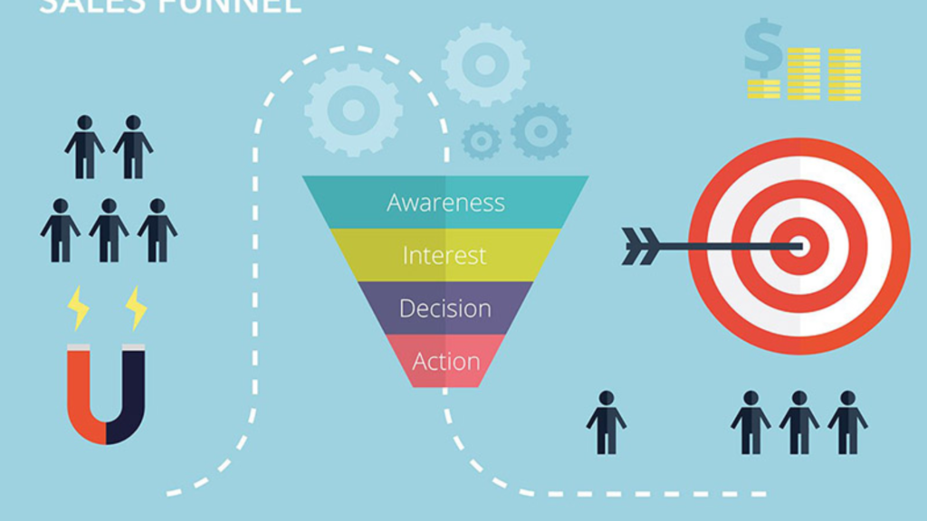
Most authors follow the "Post and Pray" method: they hit publish on Amazon, post a link on Facebook, and pray that people buy it. This is why 90% of books sell fewer than 100 copies in their lifetime. Without a structured sales funnel, you are leaving your career to chance.

The Pain of an Unplanned Launch:

  • The Invisible Release: Your book drops, but because there was no "warm-up" period, the Amazon algorithm ignores you.

  • Wasted Ad Spend: You send paid traffic directly to an Amazon page that hasn't been "warmed up," resulting in clicks that don't turn into sales.

  • The One-Week Wonder: You get a small spike in sales during launch week, followed by a total collapse in rank because you have no "long-tail" sales strategy.

  • No Reader Data: You sell books, but you have no idea who your readers are or how to sell them your next title.

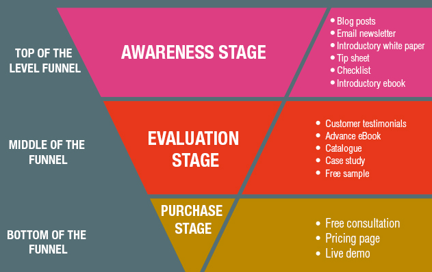
The Solution: The Multi-Stage Sales Engine

We build "Launch Funnels" that treat your book like a major product release. We don't just "announce" your book; we create a psychological journey that turns strangers into pre-order customers and long-term fans.

Our Strategic Framework:
  • The Pre-Launch Hype Phase: We build an automated "waiting list" system that captures leads weeks before the book is live, ensuring a massive Day 1 spike.

  • Advanced Review Management: We help you organize "ARC" (Advanced Reader Copy) teams to ensure you have social proof and reviews the moment the "Buy" button appears.

  • High-Conversion Landing Pages: We build custom landing pages that offer "Pre-order Bonuses" (exclusive stories, maps, or workbooks) to incentivize early purchases.

  • The "Post-Launch" Sustainability Plan: We set up evergreen email sequences that continue to introduce your book to new readers months after the initial launch.


The Result: Predictable, Scalable Success

A professional sales funnel takes the "luck" out of publishing. It gives you a repeatable system that you can use for every book you write.

  • Bestseller Rank Dominance: By concentrating your sales into specific windows, we force the Amazon algorithm to take notice and promote your book organically.

  • Higher Profit Margins: By using "Direct-to-Reader" funnels, you can sell special editions or bundles that keep more money in your pocket.

  • A Growing Author Brand: Every person who enters your funnel becomes a data point on your email list, making your next launch even easier and more profitable.

The Launch Roadmap

From Ghost to Bestseller

Most authors hit "publish" and hope for the best. We show you how to build a 30-day "Heat Map" that coordinates your email list, social media, and ARC teams to force the Amazon algorithm to rank your book on Day One.

The Profit Engine funnel

Social media reach is temporary, but a sales funnel is forever. Learn how we build automated systems that turn a single $0.99 sale into a lifelong fan who buys every backlist title you’ve ever written.

Are You Ready to Launch Like a Pro?

Don't leave your masterpiece to the mercy of an algorithm. Let’s build a sales funnel that guarantees your book gets the attention and the sales it deserves.

Amplifying the Movement of Angie Thomas

The Challenge: Building a digital stage that captures the raw, rhythmic truth of a grassroots activist while maintaining the prestige of a #1 global bestseller.

The Strategy
  • The “Legacy” Hub: Showcasing her journey from author to producer, ensuring her influence is felt beyond the final page.

  • Cinematic Storytelling: Using bold, high-impact visuals that make the reader feel the weight and urgency of her message.

  • Seamless Empowerment: Integrating resources and speaking platforms to transform a “website” into a community megaphone.

The Transformation

Before, the online presence was just a list of titles. Now, it is a cultural anchor. For an author, there is a profound emotional release in having a site that finally feels as “loud” and as honest as their own voice. MagicBookSales removes the tech-anxiety, leaving only the confidence to lead a movement.


What the Author Says

“I felt like my website was a whisper, but my work was a shout. MagicBookSales didn’t just design a site; they understood my soul. For the first time, my digital home is as fearless as the stories I write.”

Angie Thomas | #1 NYT Bestselling Author & Producer

The Heart of the Project

An author’s website shouldn’t just be a digital business card; it should be an emotional experience. For Brené Brown, we didn’t just organize data—MagicBookSales captured her “brave” and “vulnerable” essence. We turned a cluttered digital footprint into a sanctuary where readers feel safe to explore and stay.

The Magic Touches
  • Architecting Trust: We built custom hubs that guide readers through her research like a trusted friend, not a computer screen.
  • The Content Pulse: By integrating her podcasts and books into one breathing ecosystem, we ensured her voice is never more than a click away.
  • Freedom to Write: We removed the “tech-shame” and “platform-anxiety,” giving the author the emotional space to focus back on the craft she loves.


The Feeling of Success

Imagine waking up and feeling proud of your link. No more apologizing for a “messy” site. MagicBookSales delivers the peace of mind that comes when your online presence finally matches the weight of your soul’s work. It’s the transition from feeling overwhelmed to feeling empowered.

A Note from the Brene Brown

“I spent years feeling like my platform was a puzzle I couldn’t solve. MagicBookSales stepped in and didn’t just build a site; they understood my heart. For the first time, my digital home feels as warm and honest as the books I write. I finally feel seen.”

— Brené Brown | #1 NYT Bestselling Author


Is your website a home or a storage unit?

Let’s make it magic.

Cover Design for Fill-In Keepsake Gift Book

Just A Few Things I Love About You (With All My Heart)

This project focused on designing the cover for a heartfelt fill-in keepsake book created to help people express love, appreciation, and meaningful memories for someone special in their life. The cover needed to immediately communicate warmth, affection, and emotional sincerity, while feeling playful and approachable rather than overly sentimental.

The book is intended as a personal gift—something handwritten, cherished, and revisited—so the design had to feel intimate and joyful from first glance.


Design Challenge

The main challenge was to visually express love and emotional connection without relying on clichés or overly ornate visuals. The design needed to:

  • Feel inclusive and suitable for any relationship (not just romantic)

  • Balance emotional depth with lighthearted charm

  • Appeal to a wide age range, from parents and children to friends and partners

  • Stand out as a keepsake, not just another greeting card

It also needed strong shelf and thumbnail impact for online marketplaces.


Concept & Research

The core concept centered around simple acts of love and everyday appreciation.

Research focused on:

  • Emotional gifting trends and keepsake products

  • Handwritten typography styles associated with warmth and sincerity

  • Nostalgic, comforting imagery that evokes childhood, memories, and care

  • Color psychology, particularly tones associated with love, safety, and joy

The illustrated vintage-style pickup truck carrying hearts became the central symbol—representing carrying love, delivering affection, and holding meaningful memories. This visual metaphor reinforces the idea of love as something given intentionally and wholeheartedly.


Visual Approach

  • Bold, friendly hand-lettered typography to feel personal and human

  • A warm red background to instantly signal love and emotional connection

  • Soft, rounded illustration style to create comfort and accessibility

  • Clear hierarchy in text to ensure readability at small sizes

The playful lettering combined with the gentle illustration creates a balance between emotional sincerity and joyful charm.


Outcome & Results

  • A visually inviting cover that clearly communicates purpose and emotion

  • Strong appeal as a gift item rather than a traditional book

  • Excellent visibility in both physical and digital retail environments

  • A design that encourages emotional engagement before the book is even opened


Value & Benefits

  • Makes emotional expression feel easy, safe, and approachable

  • Encourages meaningful connection through a visually welcoming design

  • Appeals to a broad gifting audience across many relationships and occasions

  • Reinforces the book’s role as a lasting keepsake rather than a disposable gift

  • Demonstrates how illustration and typography can elevate emotional storytelling

Cover Design for Finance & Investing Book

Your Perfect Portfolio
The ultimate guide to using the world’s most powerful investing strategies
Author: Cullen Roche

This project focused on designing the cover for Your Perfect Portfolio, a modern investing book that emphasizes personalization, clarity, and long-term financial thinking. The goal was to visually communicate that there is no single “best” portfolio—only the one that best fits the individual investor.

The cover needed to feel credible and authoritative while remaining approachable for a broad audience, from beginners to experienced investors.


Design Challenge

The primary challenge was to visually represent a complex and often intimidating subject—portfolio construction—in a way that felt:

  • Clear and accessible rather than technical or overwhelming

  • Trustworthy and professional, suitable for a finance authority

  • Flexible enough to appeal to investors with different goals and philosophies

  • Timeless, avoiding trendy financial clichés

The design also had to stand out in a crowded finance and investing category, where covers often rely heavily on charts, numbers, or abstract graphics.


Concept & Research

The concept centered on focus, alignment, and intentional decision-making—core ideas of the book’s philosophy.

Research and inspiration included:

  • The psychology of investing and decision-making

  • The idea of “aiming” a portfolio toward personal goals rather than market predictions

  • Minimalist financial design trends that emphasize clarity and confidence

  • Visual metaphors for precision, balance, and long-term focus

The target symbol was chosen as the central visual metaphor. It represents goal-oriented investing, personalization, and disciplined strategy—key themes throughout the book. Each layer of the target subtly suggests different strategies and asset allocations working together toward a single objective.


Visual Approach

  • Clean, restrained typography to convey credibility and seriousness

  • A limited color palette to maintain focus and avoid visual noise

  • Centralized composition to reinforce clarity and intentionality

  • A strong, instantly recognizable symbol that works at both full size and thumbnail scale

The handwritten-style title typography adds a human touch, reinforcing the book’s message that investing is personal—not purely mechanical.


Outcome & Results

  • A clear and confident cover that immediately communicates purpose and focus

  • Strong visual differentiation within the investing and finance category

  • Excellent legibility at small sizes for online retailers and digital platforms

  • A design that aligns with the book’s core message: simplicity, personalization, and discipline


Value & Benefits

  • Makes a complex financial topic feel approachable and understandable

  • Reinforces the book’s core philosophy visually, before the reader opens it

  • Builds trust with readers seeking practical, thoughtful investing guidance

  • Demonstrates how abstract financial concepts can be translated into clear visual storytelling

  • Creates a timeless cover design suitable for long-term relevance in the finance space

Cover Design for Tourist Guide Book

This project focused on designing the cover and visual symbol for a tourist guide book dedicated to Adjara, Georgia. The goal was to create a simple yet culturally rich graphic identity that represents the region’s heritage while remaining visually modern and accessible to international audiences.


Design Challenge

The main challenge was to translate Adjara’s traditional culture into a contemporary visual language. The design needed to:

  • Reflect local identity and traditions

  • Feel authentic rather than decorative or cliché

  • Remain simple, bold, and easily recognizable as a cover and symbol

  • Appeal to tourists unfamiliar with Georgian culture

Concept & Research

To ground the design in authenticity, research focused on:

  • Traditional Adjarian costumes, their silhouettes, and ornamental details

  • Folk dance poses, known for their strong posture, rhythm, and expressive movement

  • Regional aesthetics that communicate pride, movement, and cultural continuity

Adjarian dance was selected as a key visual reference because it embodies both tradition and dynamism, making it an ideal symbol for tourism and cultural exploration.


Outcome & Results

  • A visually distinctive cover that immediately communicates local culture and regional identity

  • A flexible symbol that can be reused across marketing materials, signage, and souvenirs

  • Strong shelf and thumbnail visibility due to bold shapes and simplified composition

  • A culturally respectful design that avoids stereotypes while remaining approachable for tourists

Value & Benefits

  • Enhances the guide book’s appeal to international travelers by offering a clear cultural entry point

  • Strengthens regional branding by presenting Adjara as a place of tradition, movement, and character

  • Demonstrates how cultural heritage can be transformed into contemporary graphic storytelling

  • Creates a timeless design that can remain relevant beyond short-term tourism trends