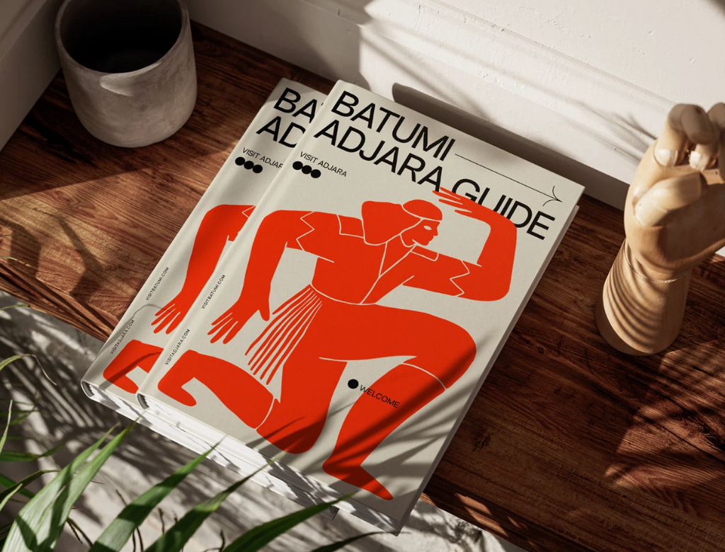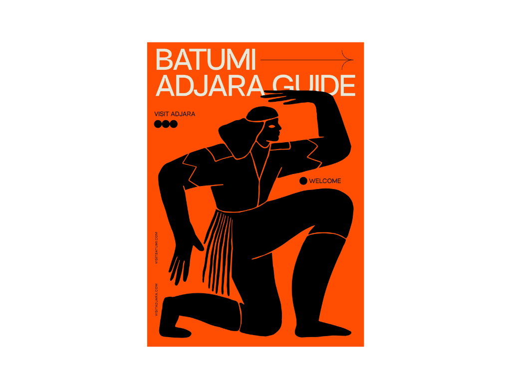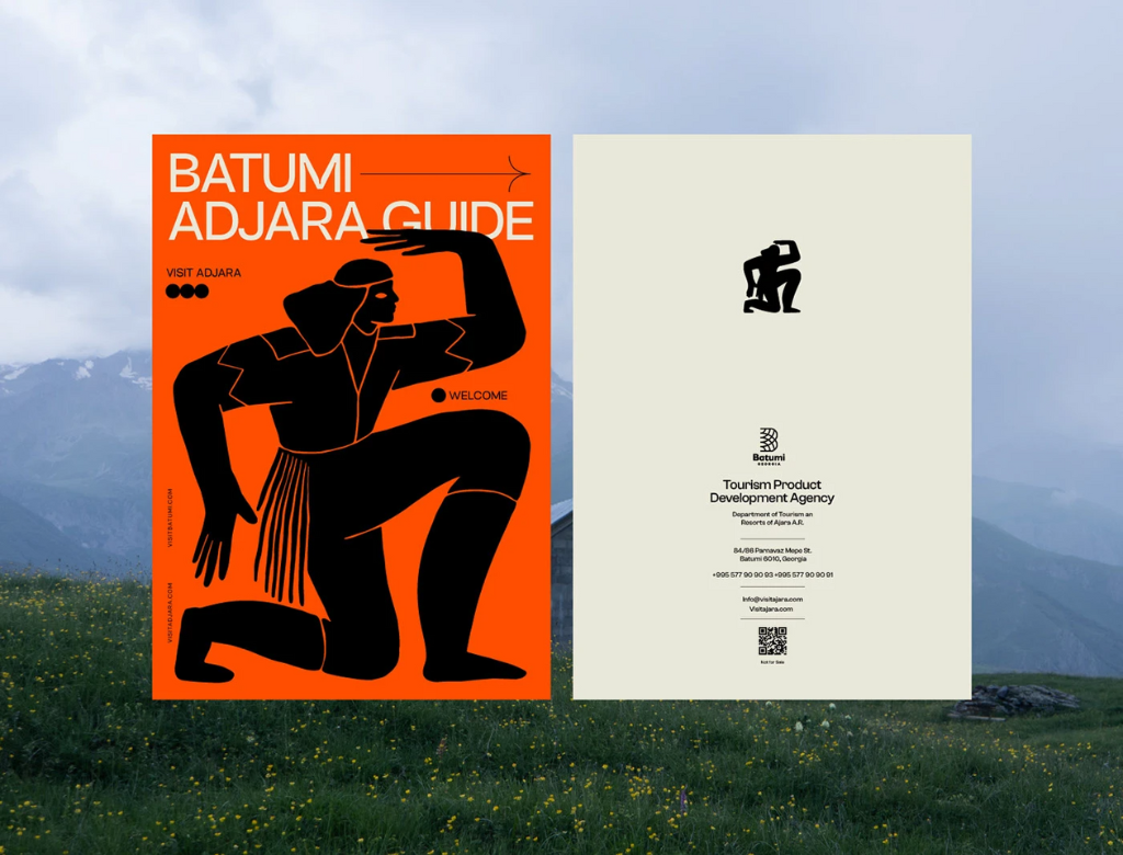
Reimagining the Batumi Adjara Guide
Transforming traditional roots into a striking visual language that commands global attention.
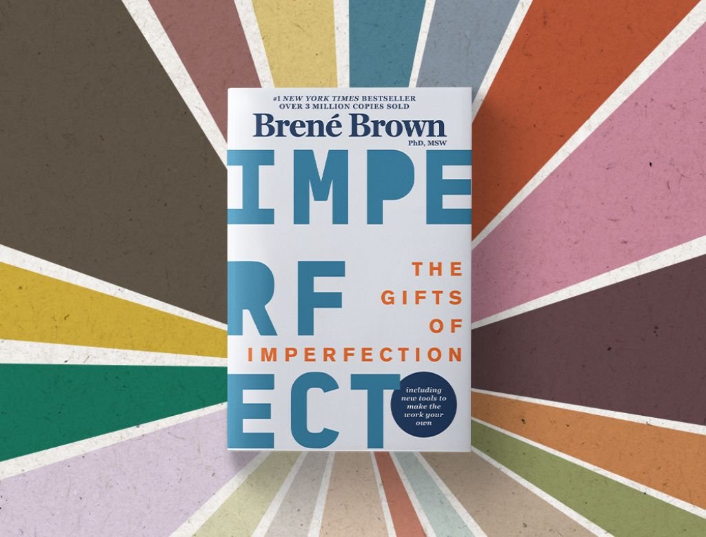
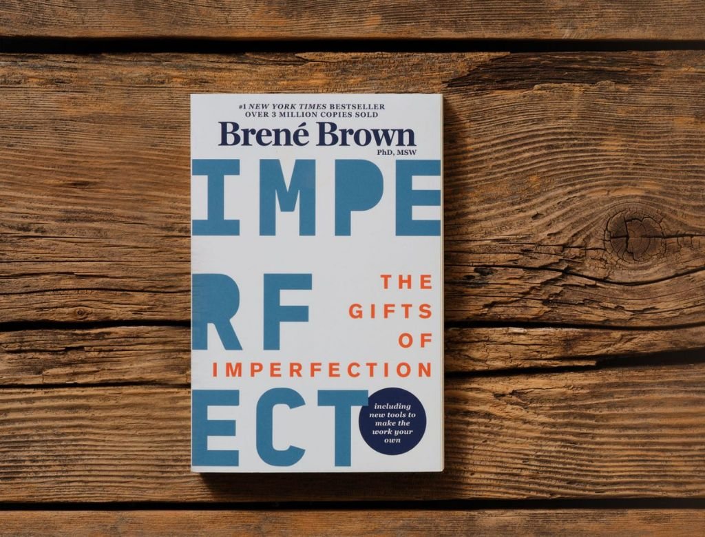
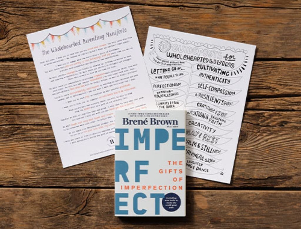
Breaking the Grid for "The Gifts of Imperfection"
Defying perfection through a raw visual disruption that transforms personal truth into a global movement.
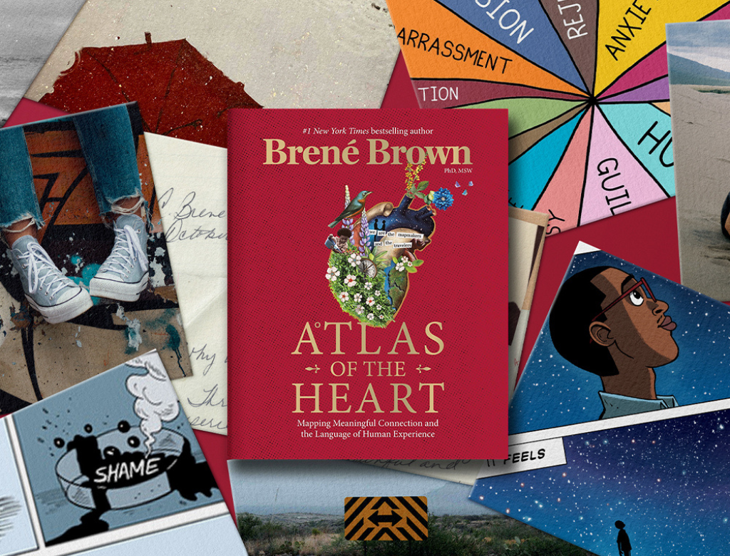
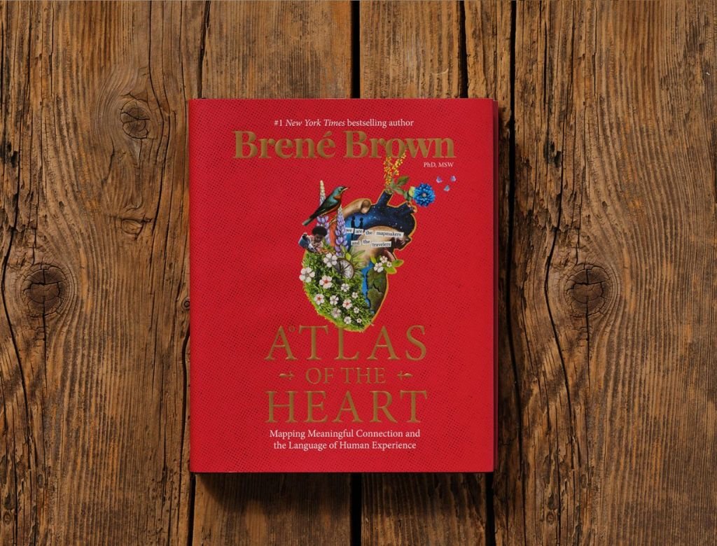
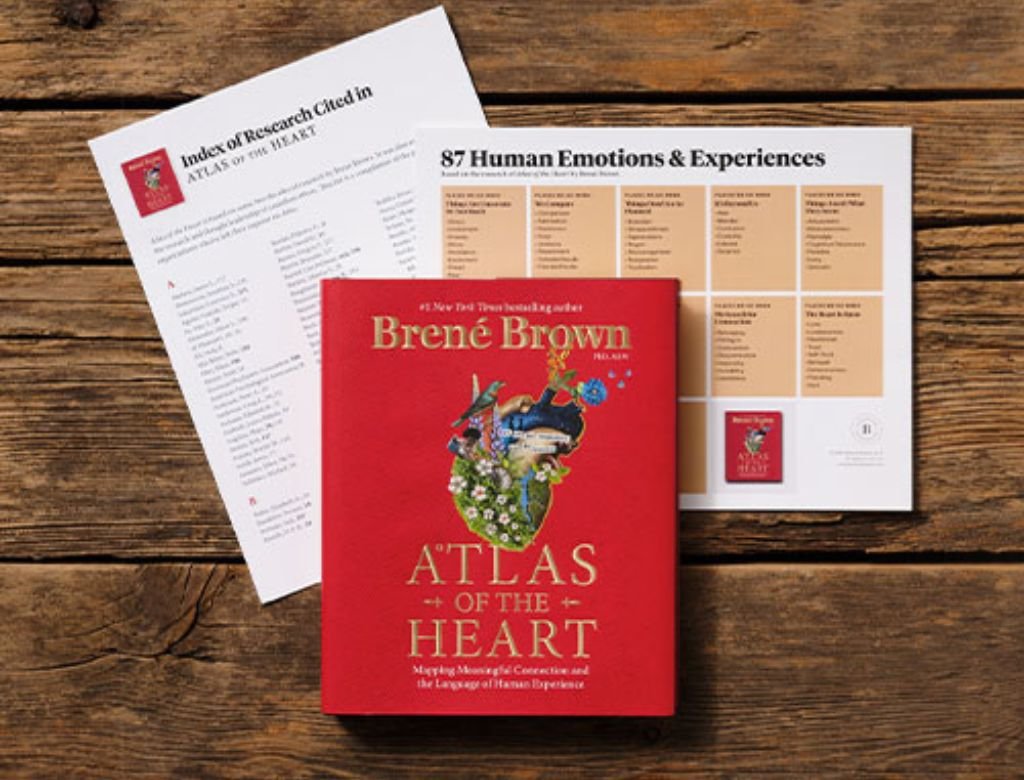
Mapping Meaning for "Atlas of the Heart"
Capturing the messy beauty of human connection through a grounded design that speaks to the soul.
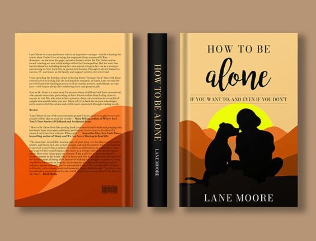
Visualizing Companionship in "How to Be Alone"
Designing a warm, sunset sanctuary that transforms the fear of solitude into a beautiful journey of self-discovery.

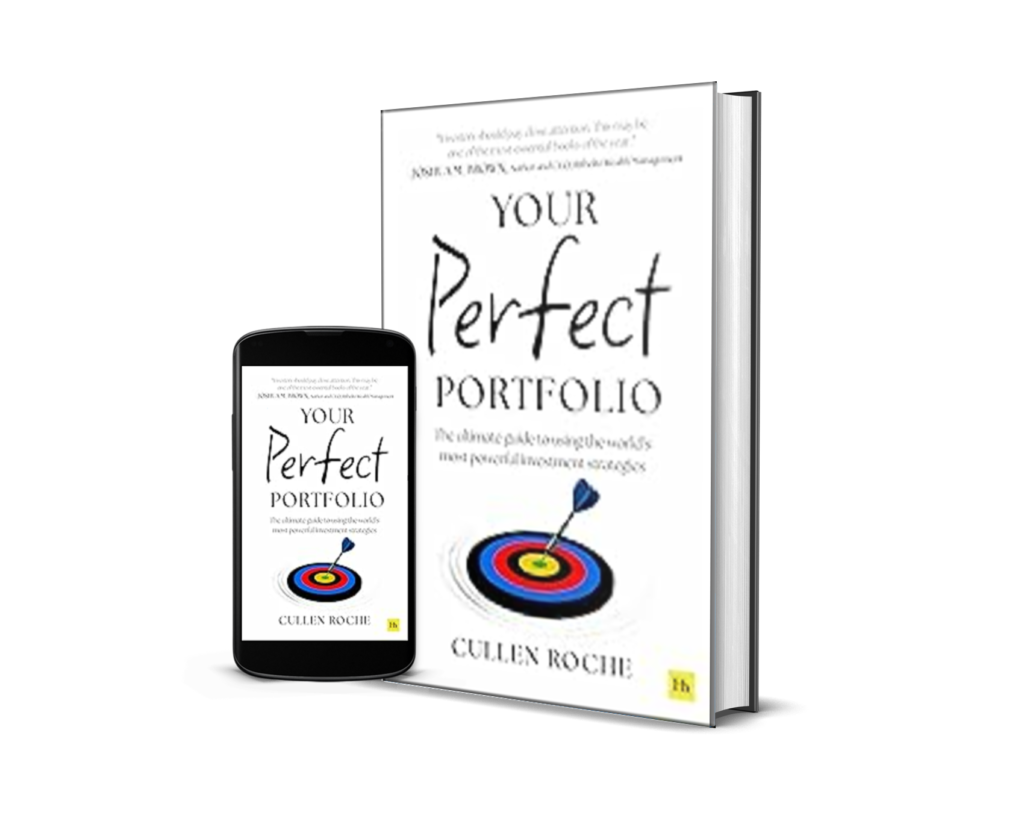
Visualizing Precision for "Your Perfect Portfolio"
Turning complex financial strategies into a visual bullseye that commands trust and immediate action.
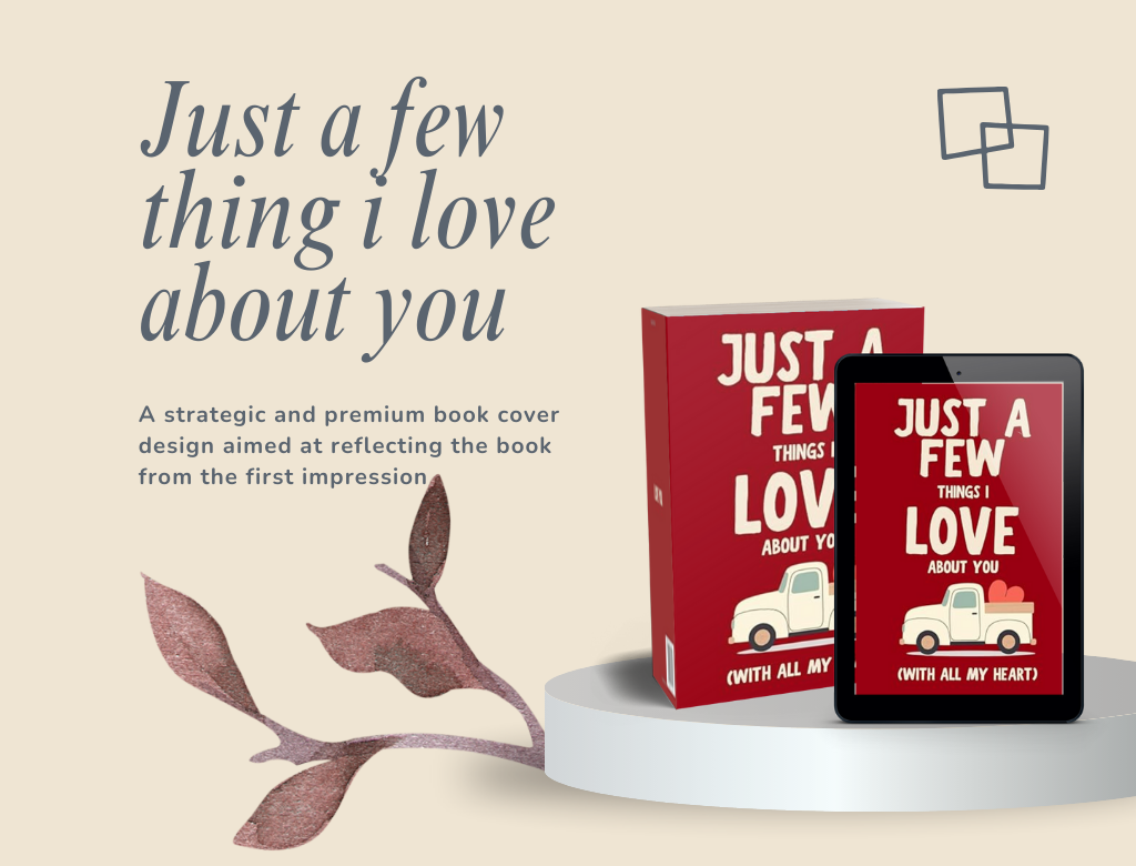
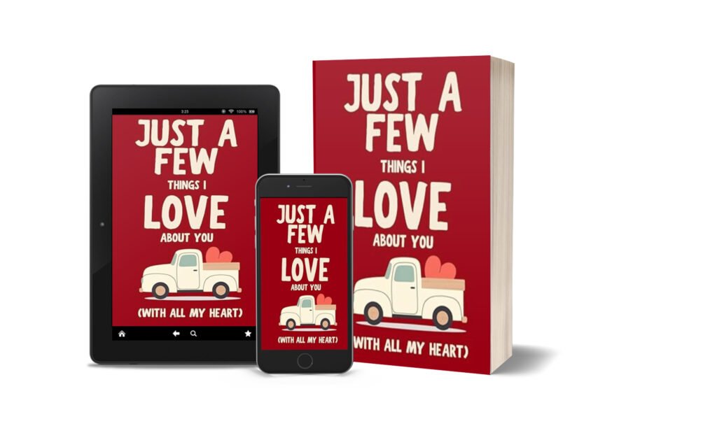
Designing the Heart of Friendship Visuals
Crafting a visual embrace that turns a simple book into a cherished, lifelong keepsake.
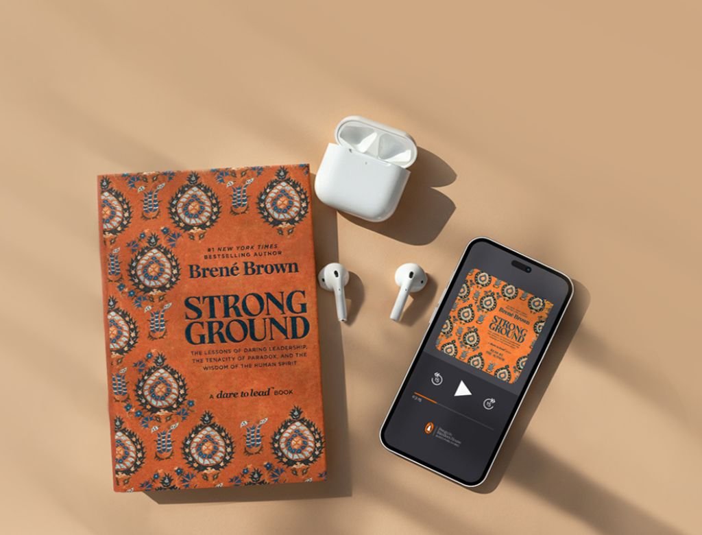
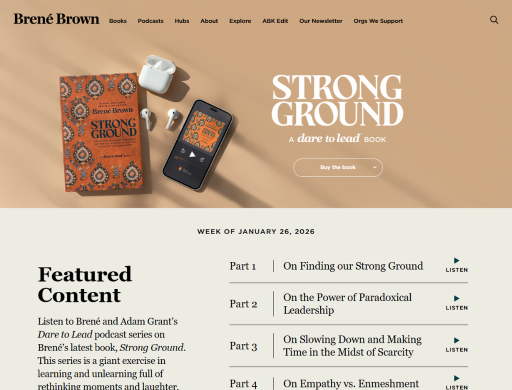
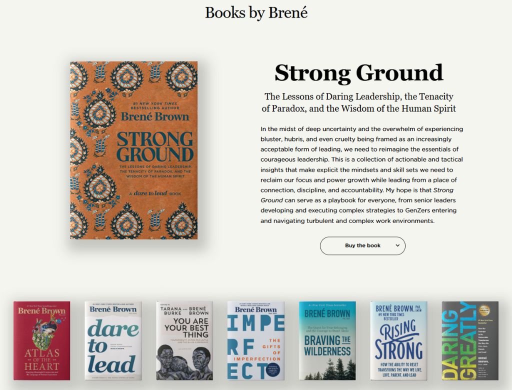
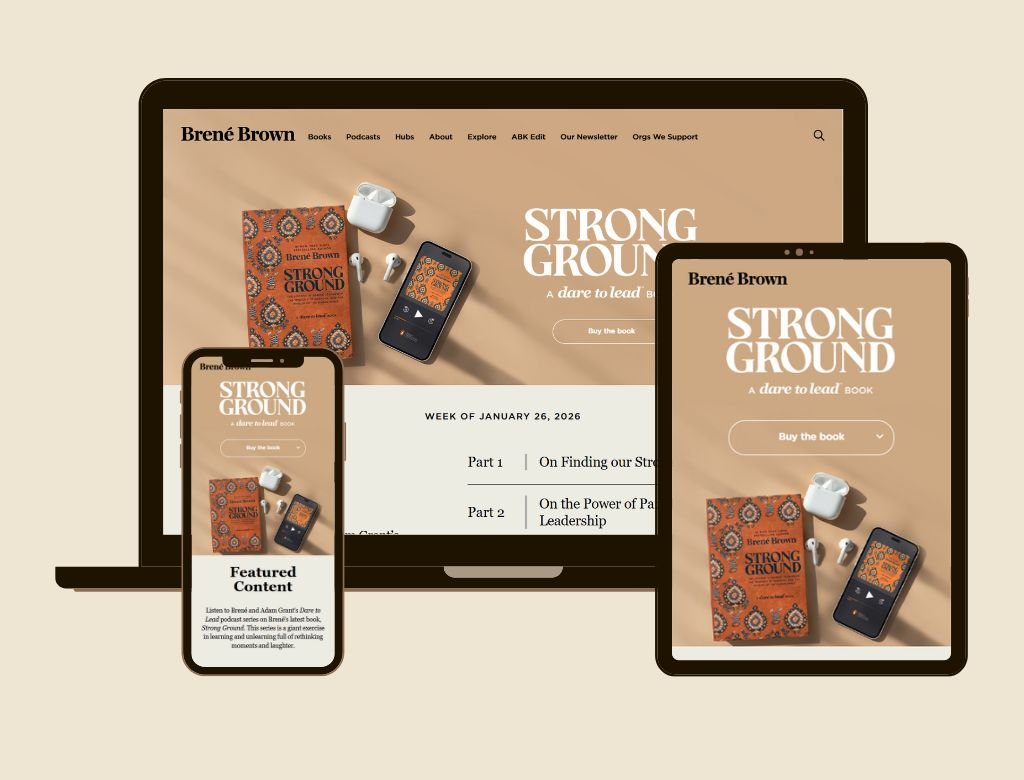
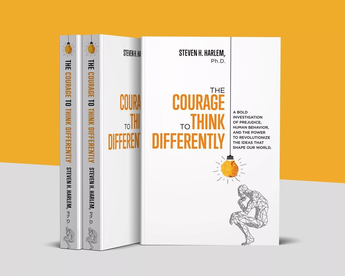
Designing the Foundation for "Strong Ground"
Forging a bold visual identity that translates internal courage into an unstoppable cultural force.

Architecting the "Life Advice" Authority for Mark Manson
Building a high-conversion digital engine that translates raw, unfiltered wisdom into a global cultural phenomenon.
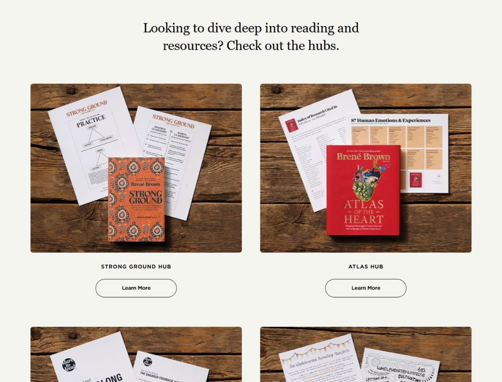
Crafting a Digital Sanctuary for Brené Brown
Creating a centralized hub that feels as intimate as a living room but functions like a global powerhouse.
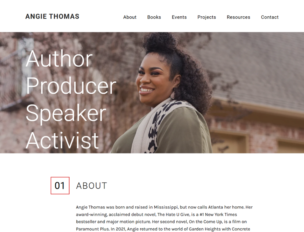
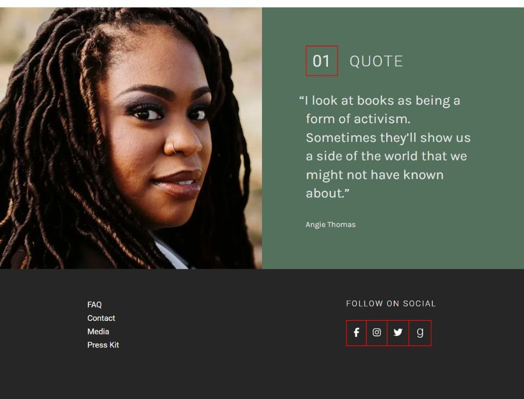
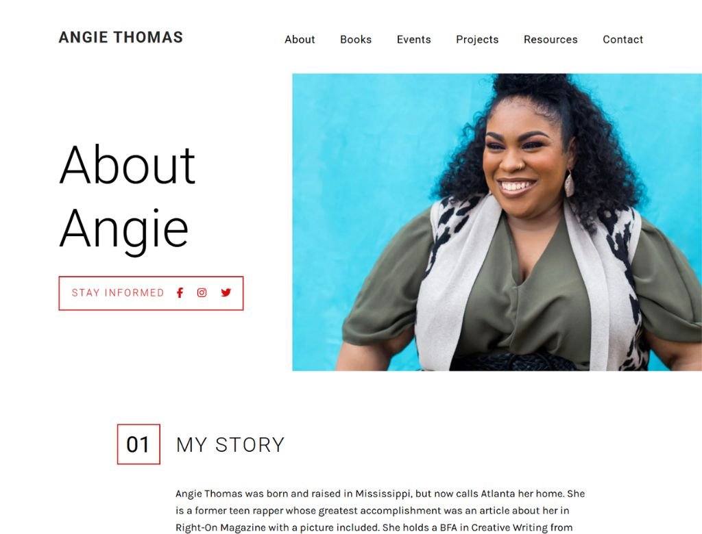
Amplifying the Voice of Angie Thomas
Building a digital megaphone that feels as raw as the streets but moves with the force of a revolution.
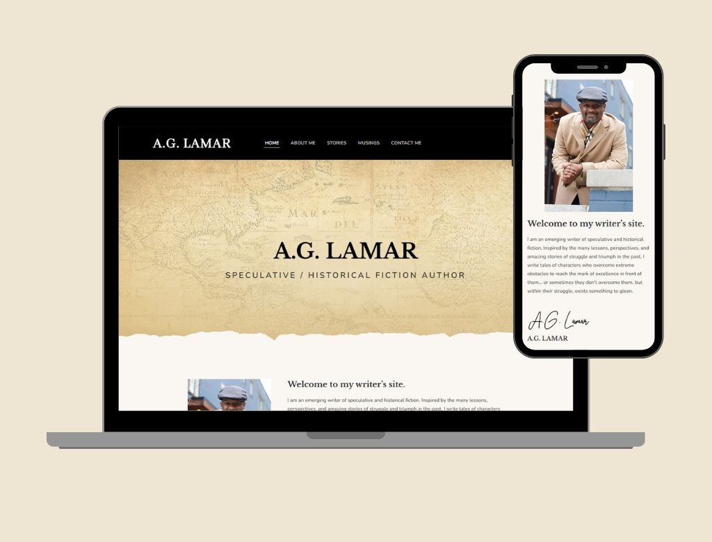
Building a Digital Time Machine for A.G. Lamar
Architecting a historical sanctuary that commands the authority of the past and the energy of the future.
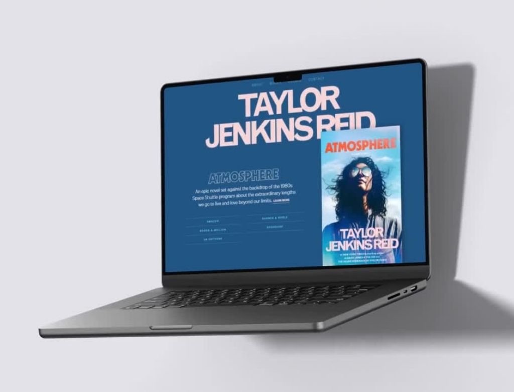
Creating a Cinematic Stage for Taylor Jenkins Reid
Architecting a high-glamour digital stage that turns a series of bestsellers into an iconic literary empire.

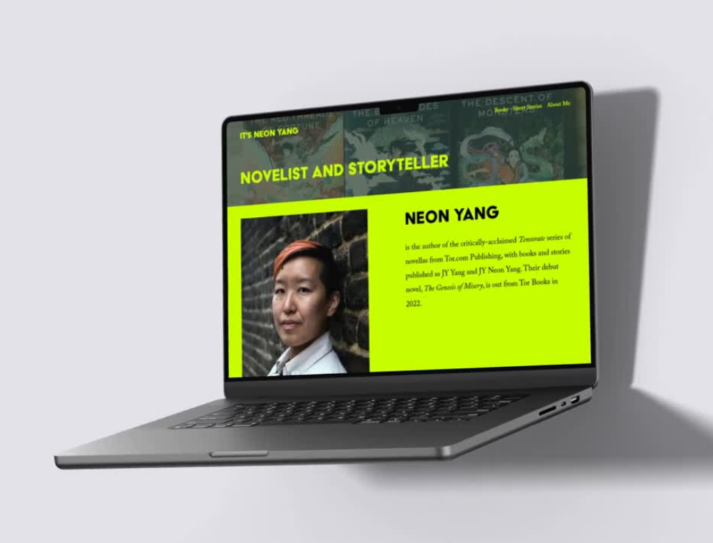
Engineering the Neon Revolution for Neon Yang
Building a high-voltage brand that feels as bold as science fantasy and as sharp as a digital revolution.
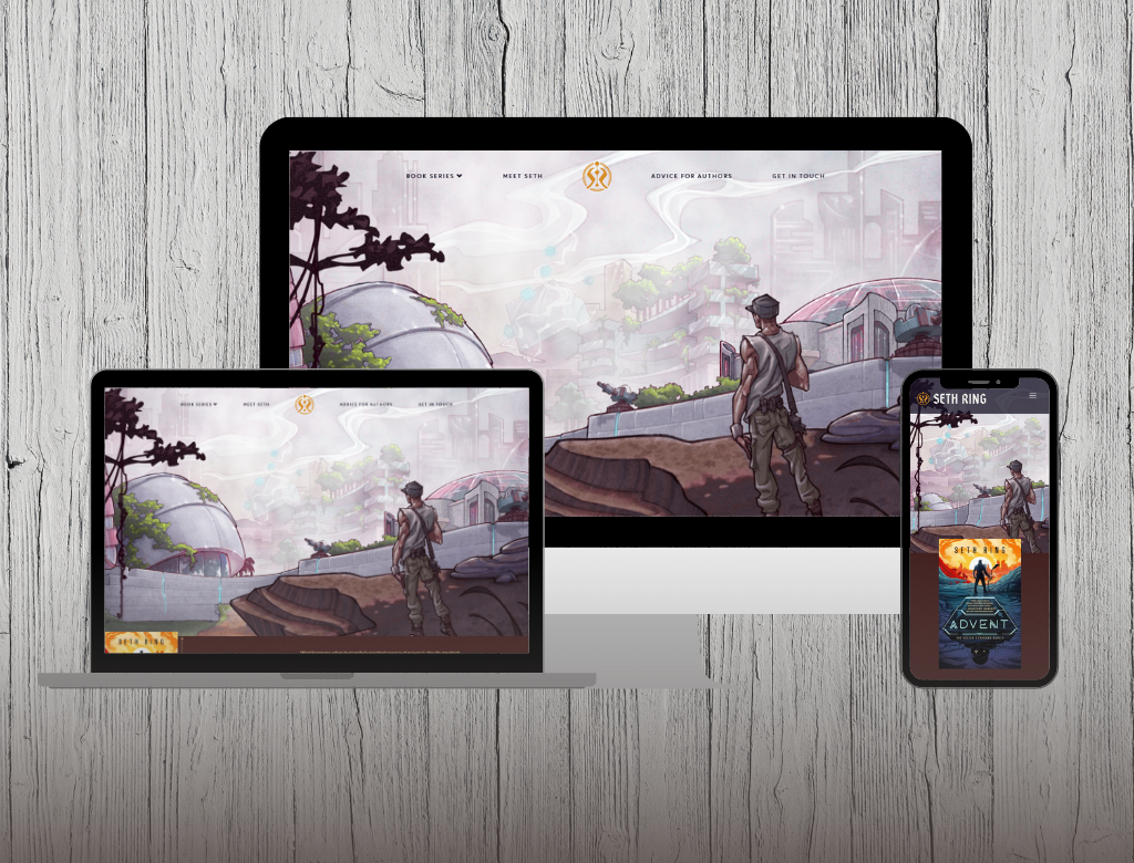
Building the Command Center for Seth Ring
Constructing a high-adventure hub that anchors a sprawling multiverse into one powerful, fan-first destination.
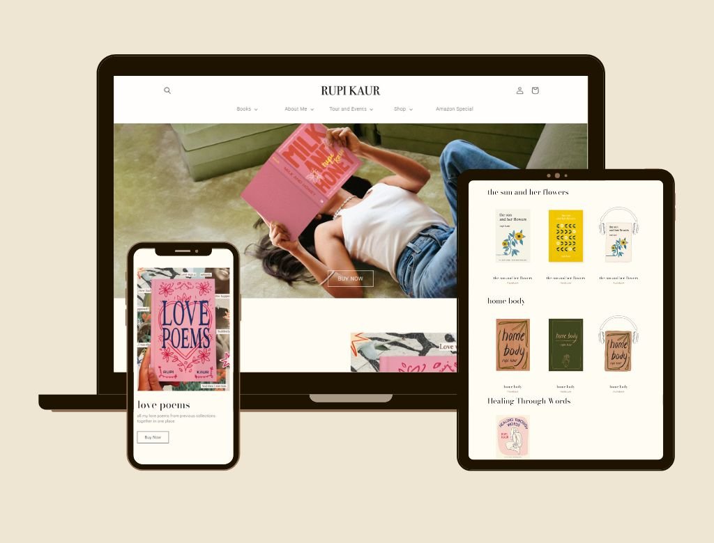
Designing a Minimalist Sanctuary for Rupi Kaur
Crafting a delicate digital sanctuary that honors raw vulnerability while scaling a global poetry phenomenon.
Designing a Minimalist Sanctuary for Rupi Kaur
Crafting a delicate digital sanctuary that honors raw vulnerability while scaling a global poetry phenomenon.
Designing a Minimalist Sanctuary for Rupi Kaur
Crafting a delicate digital sanctuary that honors raw vulnerability while scaling a global poetry phenomenon.

Designing a Minimalist Sanctuary for Rupi Kaur
Crafting a delicate digital sanctuary that honors raw vulnerability while scaling a global poetry phenomenon.
Creative Web Design
Great websites add great values to your business From wire-framing to we do it all.

Web Application
Great websites add great values to your business From wire-framing to we do it all.

Digital Agency
Great websites add great values to your business From wire-framing to we do it all.

Agency App Design
Great websites add great values to your business From wire-framing to we do it all.

Web Application
Great websites add great values to your business From wire-framing to we do it all.

UX/UI Design
Great websites add great values to your business From wire-framing to we do it all.